Plotting Data with Matplotlib: Creating Stunning Visualizations

Introduction
Did you know that 90% of the information processed by the human brain is visual? In the fast-paced digital world, data visualization is not just a fancy addition but a necessity. Enter Matplotlib, the most widely used Python library for creating powerful, publication-quality visualizations.
Whether you’re analyzing financial trends, tracking stock prices, or presenting scientific findings, Matplotlib transforms raw data into meaningful insights. This guide will take you through the fundamentals, some shocking facts, case studies, and practical examples to master data visualization using Matplotlib.
The Power of Data Visualization: Why It Matters
Before we dive into coding, let’s explore why visualization is crucial.
-
Case Study: Netflix’s Data-Driven Decisions
Netflix relies heavily on data visualization to track user behavior and predict viewing patterns. Their recommendation system, powered by data, saves them over $1 billion per year by reducing subscription churn. -
Industry Update: The Rise of Data-Driven Storytelling
In 2024, companies are shifting from raw analytics to data storytelling. Matplotlib and its extensions (like Seaborn) are being increasingly used by data journalists, AI developers, and business analysts to convey complex data effectively.
Getting Started with Matplotlib
Installation
Matplotlib is included in most Python distributions but can be installed separately using:
pip install matplotlib
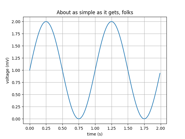
Basic Plot: The "Hello World" of Matplotlib
Let's start with a simple line graph to understand the structure of a Matplotlib plot:


Understanding the Code:
- plt.plot(): Plots the line graph.
- marker='o': Adds circles at each data point.
- linestyle='-': Connects the points with a line.
- plt.xlabel()/plt.ylabel(): Labels the x-axis and y-axis.
- plt.title(): Gives a title to the graph.
- plt.legend(): Displays a legend.
- plt.show(): Renders the plot.
Types of Plots in Matplotlib
1. Bar Charts - Best for Categorical Data
Used for comparing different groups, e.g., sales across different regions.


2. Scatter Plots - Great for Identifying Correlations
Perfect for showing relationships between two variables.


3. Histograms - Best for Understanding Distributions
Used in statistics to understand how data is distributed.


Advanced Matplotlib Techniques
1. Adding Multiple Plots in One Figure


2. Styling Your Plots
Matplotlib offers pre-defined styles that make plots look professional.

Try plt.style.available to see available themes.
Shocking Fact: The Hidden Use of Data Visualization
Did you know that NASA once failed a $125 million Mars mission due to a data misinterpretation issue? If proper visualization tools were used, the conversion error between metric and imperial units could have been spotted earlier.
Conclusion: Matplotlib is More Than Just a Library
Matplotlib isn’t just for creating graphs; it’s about telling a compelling data story. Mastering it opens doors to various fields such as finance, AI, research, and business intelligence.
Key Takeaways:
✅ Visualization makes complex data easier to understand.
✅ Matplotlib offers various plot types for different data needs.
✅ Styling and customization take your plots to the next level.
🚀 Ready to take the next step?
Try integrating Seaborn and Plotly for interactive and visually appealing plots!
FAQs
Q1. What is Matplotlib mainly used for?
Matplotlib is used for creating static, animated, and interactive visualizations in Python. It helps in plotting data and making trends more understandable.
Q2. What’s the difference between Matplotlib and Seaborn?
Matplotlib is a low-level library that offers full control over the appearance of plots, while Seaborn is built on Matplotlib and provides easier, more aesthetically pleasing statistical visualizations.
Q3. Can I create interactive plots with Matplotlib?
Yes! By using plt.show(block=False) and integrating with IPywidgets, you can create interactive visualizations.
Q4. What are some real-world applications of Matplotlib?
- Financial trend analysis
- Machine learning model evaluation
- Social media analytics
- Business sales forecasting
Final Thought: In today’s data-driven world, those who master visualization master decision-making. So, start plotting your way to insights today. 🚀


No comments:
Post a Comment